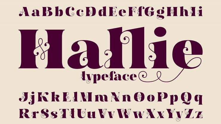
In the dynamic world of typography, where design trends ebb and flow, sans-serif fonts emerge as the avant-garde trailblazers, exuding a clean, modern aesthetic. This exploration delves into the essence of sans serif fonts, unravelling their origin, design principles, and their prominent role in contemporary design landscapes.
Understanding Sans Serif:
- A Brief Origin Story: Unlike their serif counterparts, sans-serif fonts shed the decorative strokes at the end of letterforms. This design choice contributes to a minimalist and straightforward appearance. The roots of sans-serif fonts can be traced back to the early 19th century, with notable contributors like Vincent Figgins and William Caslon.
- Minimalism and Simplicity: Sans-serif fonts are celebrated for their simplicity and minimalism. The absence of serifs results in a cleaner and more streamlined appearance, making them particularly effective in conveying a sense of modernity and clarity.
Popular Sans Serif Styles:
- Helvetica: The Epitome of Modernity: No exploration of sans-serif fonts is complete without a nod to Helvetica. Originating in the mid-20th century, Helvetica is a paragon of clean and versatile design. Its neutrality and legibility have made it a staple in various design applications, from signage to corporate branding.
- Roboto: A Digital Era Dynamo: Roboto, designed by Google, exemplifies the adaptability of sans-serif fonts to the digital era. Engineered for optimal readability on screens, Roboto has become synonymous with contemporary user interfaces, embodying the spirit of the digital age.
Versatility in Design:
- Responsive Design Prowess: Sans-serif fonts seamlessly adapt to responsive design principles, ensuring clarity and readability across a spectrum of devices and screen sizes. This adaptability has contributed to their widespread usage in web design, where fluidity and responsiveness are paramount.
- Bold Branding Choices: Brands seeking a bold and modern identity often turn to sans-serif fonts. The simplicity of sans-serif typefaces allows for clear and impactful brand messaging, making them a favorite for logos, marketing materials, and digital platforms.
The Digital Age Impact:
- Digital Readability and Accessibility: The rise of digital platforms and online content consumption has amplified the importance of digital readability. Sans-serif fonts, with their clean lines and straightforward design, enhance readability on screens, contributing to a positive user experience.
- Web-Safe Sans Serif Alternatives: As with serif fonts, the digital age prompted the creation of web-safe sans-serif alternatives. Fonts like Arial, Verdana, and Calibri became go-to choices for web designers aiming to maintain a modern aesthetic without compromising readability.
Tips for Effective Use:
- Consistency is Key: When using sans-serif fonts, maintaining consistency across a design is crucial. Stick to one or two sans-serif typefaces to create a cohesive and professional look.
- Hierarchy with Weight and Size: Utilize font weight and size to establish a visual hierarchy in your design. Bold weights can be employed for headings, while lighter weights maintain readability in body text.
Conclusion: The Enduring Appeal of Sans Serif Typography
As we traverse the ever-evolving landscape of design, sans-serif fonts continue to command attention with their contemporary allure. From the sleek digital interfaces to iconic brand logos, sans-serif fonts dance on the cutting edge of design, proving that in the realm of typography, simplicity is a powerful statement.


